


A burndown chart (sometimes also called a “burning chart”) is a method for tracking efficiency in Agile project management. It provides a simple way to visualize the number of tasks your team completed against the number of tasks your team still needs to complete. The line of incomplete tasks slowly diminishes along with the ideal burndown plan. The tasks-to-complete start out high and slowly fizzle out, hence the name.
What Are Burndown Charts?
A burndown chart, or “burn down chart,” is a visual tool used in Agile methodologies to map out the amount of work remaining for a project against the time left. Scrum teams often refer to a similar concept, the work the team will complete within a time period, as “sprints.”
In essence, sprints help teams ensure they complete projects on time. Burndown charts are one way to represent the likelihood of this happening and to track progress over time.
Most burndown charts measure outstanding work on the vertical axis (Y-axis) and time on the horizontal axis (X-axis).
Example
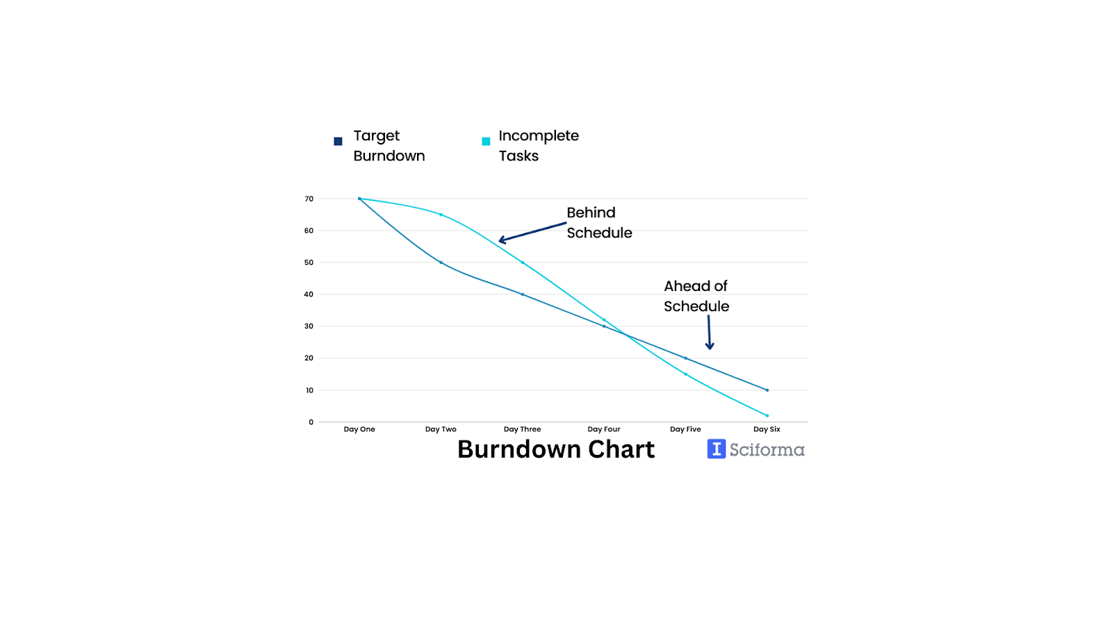
Alt text: Burndown Chart Example
Why create a burndown chart?
Agile project management teams may be the most frequent users of the burn down plan model. However, they’re certainly not the only teams who can benefit from one. A burnout chart can help just about any project management team determine how projects are progressing. These charts can also measure how their completed tasks compare to their prescribed timelines and what employees are saying about the project.
Here are a few more reasons that you may want to create a burndown chart, whether you’re entering a sprint or not:
- Burndown charts are great prediction tools that help your team visualize when you will complete projects (not just an ideal timeline).
- Reflecting on burndown charts enables project teams to learn more about bottlenecks in their work process and address them.
- Creating burndowns gives your team visibility into any scope creep that may occur.
- Burndown charts can act as roadmaps that help your team understand what they need to do so everyone stays on track.
- A burndown chart can motivate the people working on a project to be efficient.
How to Create a Burndown Chart on Sciforma
How you create a burndown chart depends on how you currently track your project information and data. If you’re using a project portfolio management software like Sciforma, you can create a burndown chart in seconds. Sciforma uses built-in tools and your recorded project data to make these charts.
Sciforma automatically creates burndown charts for you, so you don’t need to make one from scratch. To access the burndown chart for any given project, on Sciforma, here are the steps:
1. After logging into the HTML5 client, click on the Agile tab of the work workspace.
2. Navigate to Project Data Selector and select the project that you want to work on.
3. In the Timeline section, click on the Iteration Name.
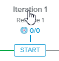
4. Click on the Overview tab.
If you are in the Project Dashboards full-screen view, you can also see The Burndown Chart in the Performance tab.
How to Make a Burndown Chart from Scratch
And if you want to make a burndown chart from scratch, make sure your burndown chart has each of the following elements:
- X-axis – This will represent the total time within your sprint or project.
- Y-axis – This will represent the remaining effort that you need to complete the project or sprint goal.
- Actual Work Remaining Bars – Any work that’s remaining within the project or sprint will be represented using vertical bars (like a bar graph). You can use this element to track how many tasks you completed each day to see when the bulk of the work was done.
Ideal Work Remaining Line – This line will represent the ideal point for your team. If your remaining work bars are below the line, your team will be on track to finish on schedule. If not, you’re not currently set up to finish on time; you may need to make adjustments to your game plan.
How to Use It
When you plan out a project, include information regarding how long you expect each task to take. This allows you to create the ideal burndown plan. With Sciforma, as team members finish tasks and mark them as “complete,” then the burndown chart will automatically update. Thus, you can watch your team’s progress in real-time.
If you notice areas where certain tasks are not complete, then you can have a conversation with the person assigned to those tasks and potentially recalibrate if there is any roadblock. You can also use the burndown chart to track how realistic your expectations are, and how upfront your team is being about their productivity.
As you work on the project, share images of the burndown chart with your team so that they can track their progress. The burndown chart is a great motivation tool since it displays data so clearly and effectively.
Turn Your Strategic Plans into Action With Sciforma
Sciforma is an all-encompassing project management software that takes the hassle out of your work for you. Our solutions ensure success for your strategies and save time for your entire team.
The Sciforma burndown chart feature is intuitive and easy to use. Sciforma offers burndown charts and hundreds of other solutions for work and time management and allows for customization so it best matches your strategies.